preface
Nowadays, with the diversity of equipment sizes, products need to be adapted to more sizes in the design process. The combination of layout scheme and grid system can achieve cross platform and cross size adaptation, which greatly improves the design efficiency. A little friend shared the article of adaptation and selection before, and also mentioned the grid. You can review [adaptation design and selection of web products].
In fact, the vast majority of designers know that grid is very important, and many enterprise level systems on the market are also using grid systems to standardize the layout of information content, but many designers directly face the conclusion that most of them know only a little, and they have no way to start their own design.
The author has browsed a large number of articles and shared them with you in combination with the experience summary in work, hoping to help understand the essence of grid system and apply it to product design by drawing inferences from one instance. First, let's start with the basic grid system analysis.
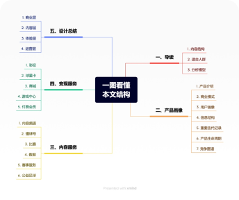
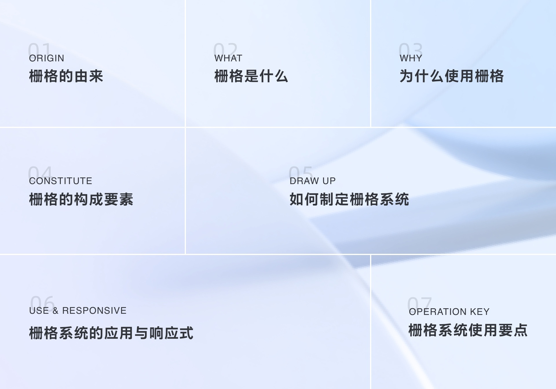
Article overview
The origin of chapter one grid
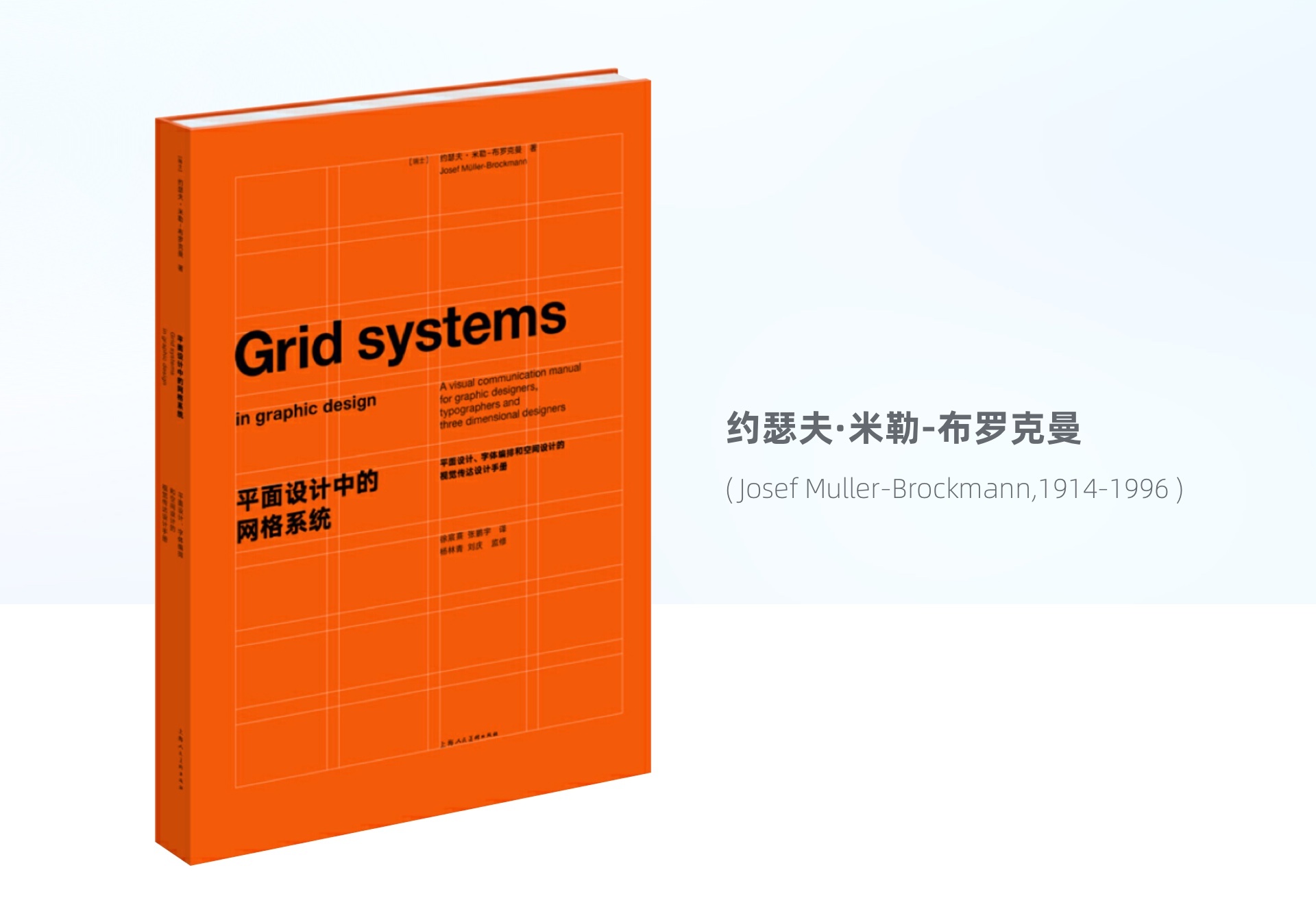
The earliest concept of grid came from the "grid" in graphic design. As early as 1692, Louis XIV, the newly crowned king of France, was dissatisfied with the printing level of France at that time and ordered people to establish a royal special committee to manage printing. It aims to design a scientific, reasonable and functional new font. Led by the mathematician Nicolas jaugeon, the committee is based on Roman script and adopts square as the design basis. Each font square is divided into 64 basic square units, and each square unit is further divided into 36 small cells. In this way, a printed page is composed of 2304 small cells. In this rigorous geometric grid network, the shape of the font is designed, the layout of the page is arranged, and the efficiency of the communication function is tested, This is the earliest scientific experiment on fonts and layouts in the world, and it is also the earliest prototype of the grid system. Later, at the beginning of the 20th century, graphic designers found that by maintaining the visual order, the layout can transmit information more clearly and effectively, so they gradually evolved a method of graphic design. Until the late 1940s, printing works using grids for auxiliary design appeared for the first time. The book "grid system in graphic design", written by Josef m ü ller Brockmann, a Swiss designer master, has sold well since its publication in 1961 and has a far-reaching impact on the design industry. It was called Swiss typography movement in history, and later became the world's popular international Typographic Style.
Chapter two what is a grid
To put it simply: grid is a tool to standardize the layout of modules and the distribution of information elements in the interface and assist designers in organizing information by forming a stable basic framework through regular grid arrays. As mentioned earlier, the grid system commonly used in UI design is developed from the planar grid system. The essence of grid and grid is actually interlinked. Then some students will ask, what is the difference between the two? In graphic design, the medium of [grid] application is generally fixed paper size, with fixed width and height. The grid is divided into equal squares. In UI design, the width of [grid] changes with the device width, and the height depends on the content. Therefore, when designing, we only need to formulate vertical segmentation rules to regulate the arrangement of elements such as the alignment and spacing of content in the vertical axis direction, which is why we see that grids are often presented column by column.

Why does chapter three use grids
- To user
The regularity of content layout reduces the cognitive cost of users:
To some extent, from the perspective of designers, grids define the restriction rules for important parts of typesetting, such as alignment relationship, white space relationship, proportion and segmentation relationship of graphics and text, which help us better implement the design, output a more balanced and orderly layout, and clear page information display, which is conducive to improving users' reading and browsing efficiency and reducing cognitive costs.
- To designer
Improve the unity of decision-making efficiency and design output:
For larger teams, designers can reduce the cost of decision-making by using the grid system, and adopt a set of unified standards to constrain and effectively coordinate designers, so that designers can quickly locate general rules and implement the design, improve the decision-making efficiency of designers, and standardize the quality of design output. At the same time, it also avoids the chaos of various pages. When there are multiple business lines sharing the same system specification or multiple designers cooperating to design projects, the grid system helps to strengthen the design consistency and unify the output standards.
- To development
Improve design reduction and reduce interpretation costs:
In the process of docking and cooperation with the development side, we have a set of top-down design rules to follow, and the principle of rule calculation is consistent with the development habits, which can avoid repeated communication of details, improve the design reduction degree of development, and reduce unnecessary interpretation costs.
In addition, the grid is also conducive to the reuse of components and modules by designers and developers to further improve the efficiency of collaboration.
- To responsive
More regular and reasonable realization of self adaptation:
Nowadays, multi screen design is an indispensable part of commercial design, and responsive design has naturally become an indispensable part of design. The establishment of grid system can make the responsive layout rule-based, compatible with different device sizes, and more standardized and reasonable to complete the adaptive design of pages under multi platform and multi size.
Constituent elements of chapter four grid

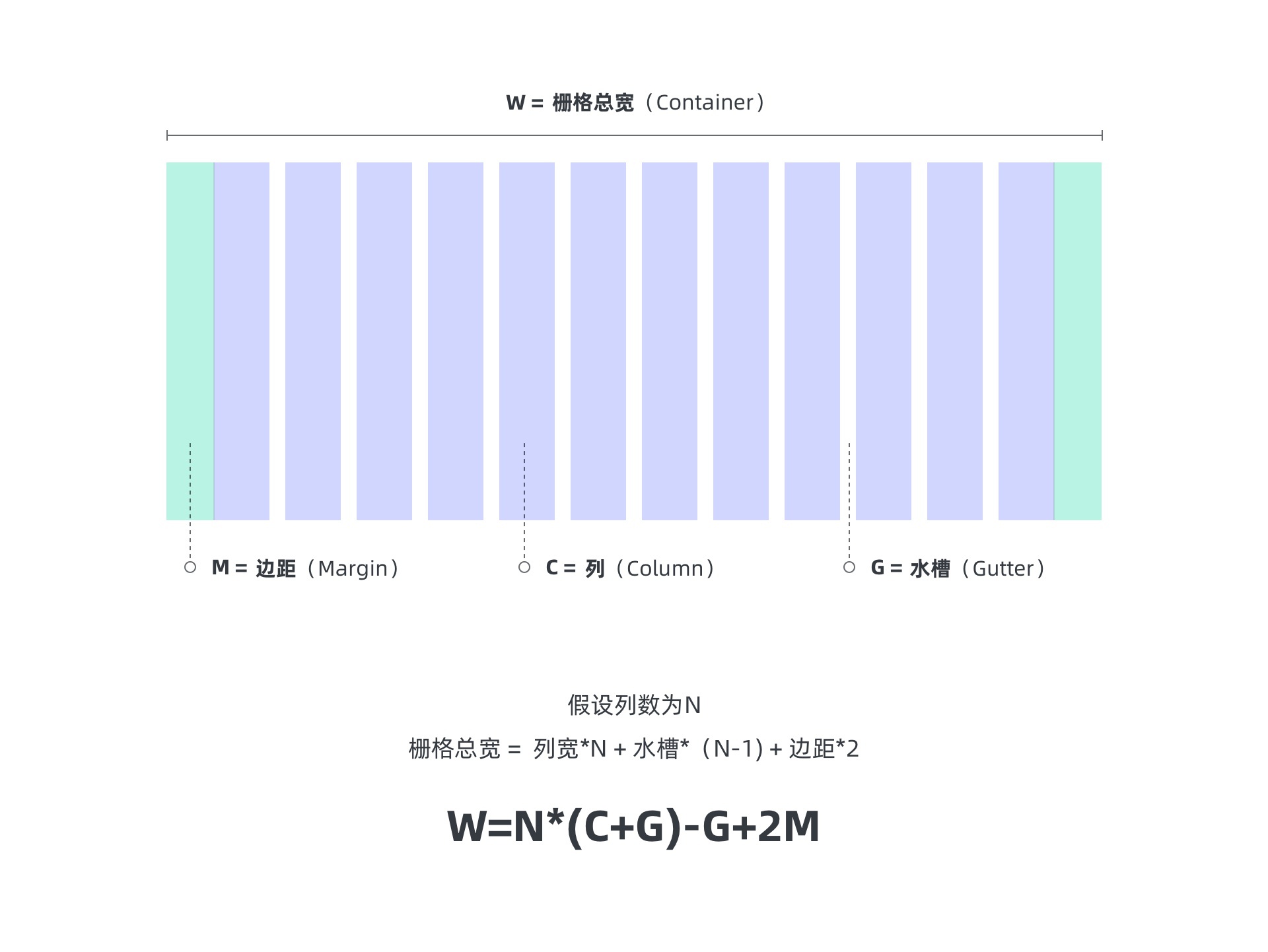
- Grid (gird)
- Column
- Sink (gutter)
- Margin
- Total width of grid (container)
- Container box (col-n)
Each system on the market has different descriptions of grid terms. Novices often look at it more and become more confused. In fact, there is no need to tangle with the subtle differences in specific terms. All changes are inseparable from its religion. It is enough to understand the meaning of its essential expression and the structural principles of the grid. The following will explain these basic terms.
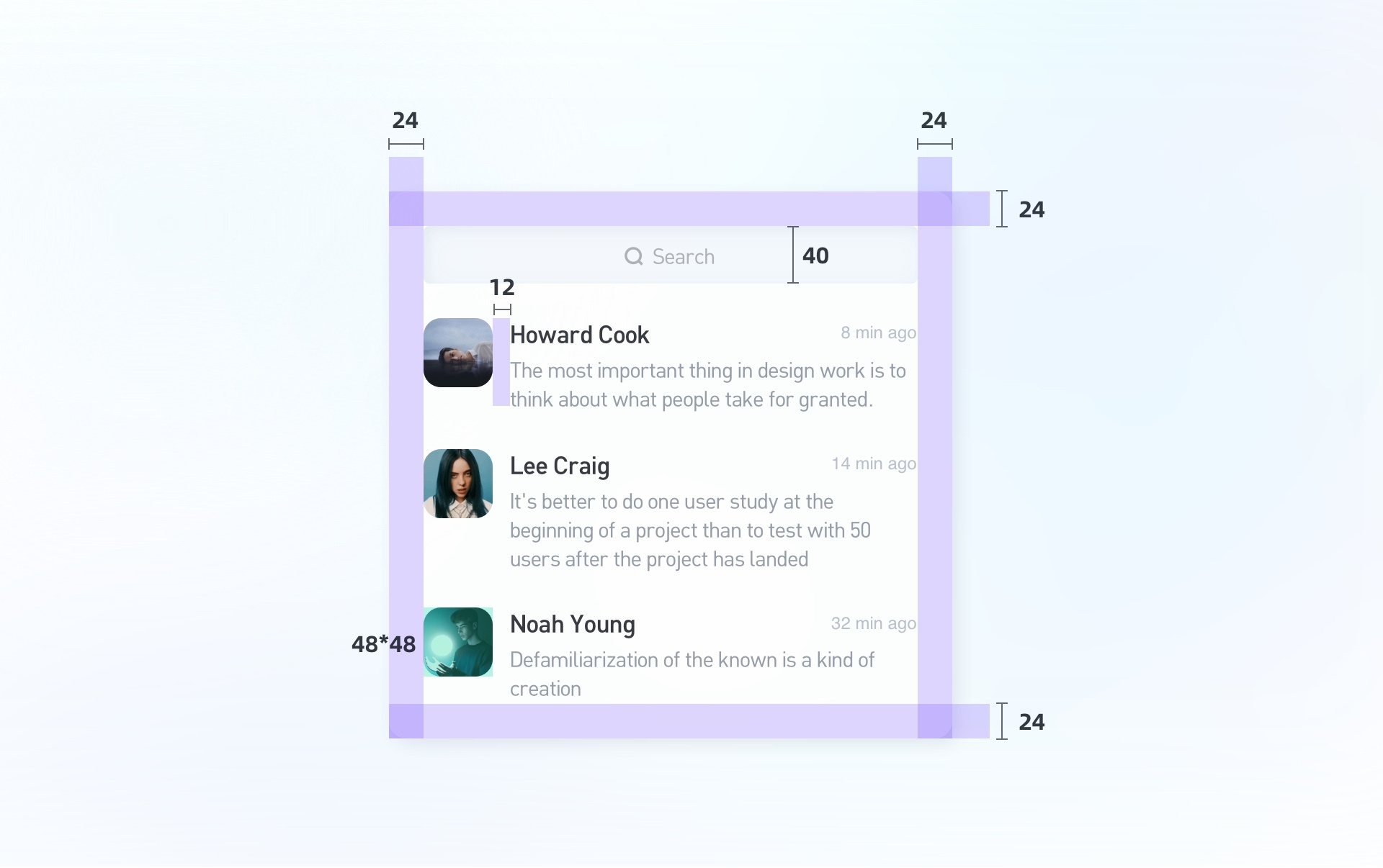
1. Grid (gird): principle of minimum unit -8 pixels
The basic composition of gird is cells, which form a grid. The smallest cell is the unit basis of the interface, and all interface elements are distributed according to this basic unit layout, which has important guiding significance for creative decision-making.
Usually, we use 8 as the smallest cell to establish the grid.
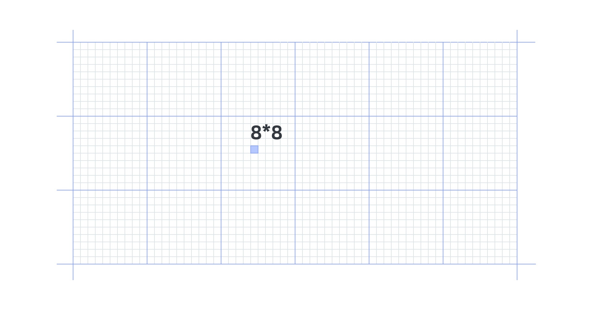
Use a multiple of 8 to define the spacing of modules and the size of elements.
So why is it 8, not something else? The reasons are as follows:
a. Even number thinking: as an even number, 8 can adapt to most device screens on the market and is more universal. It can also ensure that the size does not appear odd and subpixels such as 0.5 and 0.75 when outputting various times (IOS exports 1, 2 and 3 times, Android exports 1, 1.5, 2, 3 and 4 times are even).
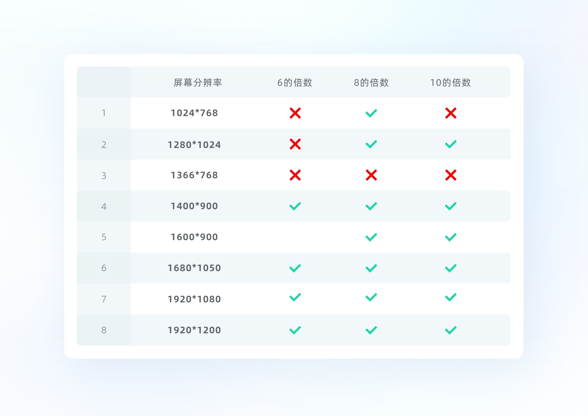

b. Regularity: all elements take 8 pixels as the step unit, and use the multiples of 8 or 8 to regulate the element and spacing size (for example, use the numbers with a regular relationship between 4, 8, 16, 24, 32, etc. and 8).
c. Sense of rhythm: compared with numbers such as 6 and 10, taking 8 as the unit, it is neither too trivial in visual perception, nor scattered in content due to too large spacing, which is easier to ensure the coordination of page effect.
d. At present, many open source codes in the market also take the multiple of 8 as the default design size, and the feasibility has been verified for many times. Designers have a relatively unified understanding of the page in the process of docking with the development, which effectively reduces the cooperation cost and is more guaranteed in the degree of design restoration.
Key points: note that the recommended size is given here, and the formulation of the minimum unit needs to be determined in combination with specific use scenarios. Our ultimate goal is to solve the problem.
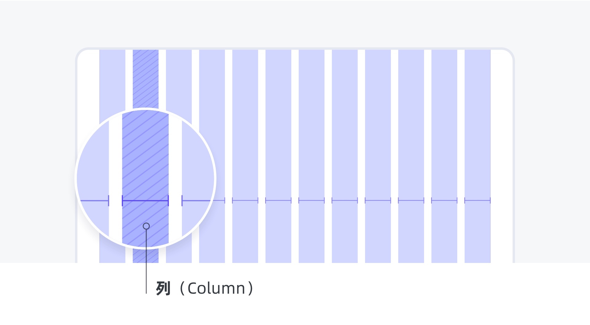
2. Column
The function of column is usually to align the content, and the column is also the quantity unit of the grid. You can understand that setting the number of grids is to set the number of columns. For example, 12 grids have 12 columns, and 24 grids have 24 columns. By controlling the number of columns, you can control the breathing section of the interface layout. The more the number of columns, the finer the content layout can be, and it is easy to divide it too finely. On the contrary, the fewer the number of columns, The content layout is also easier to be sparse and loose.
3. Sink (gutter)
After understanding the column, let's talk about the gutter. The gutter is the separation space between the columns. Here, the function of the gutter is to help separate the block content. It should be noted that no block content can be placed in the gutter.
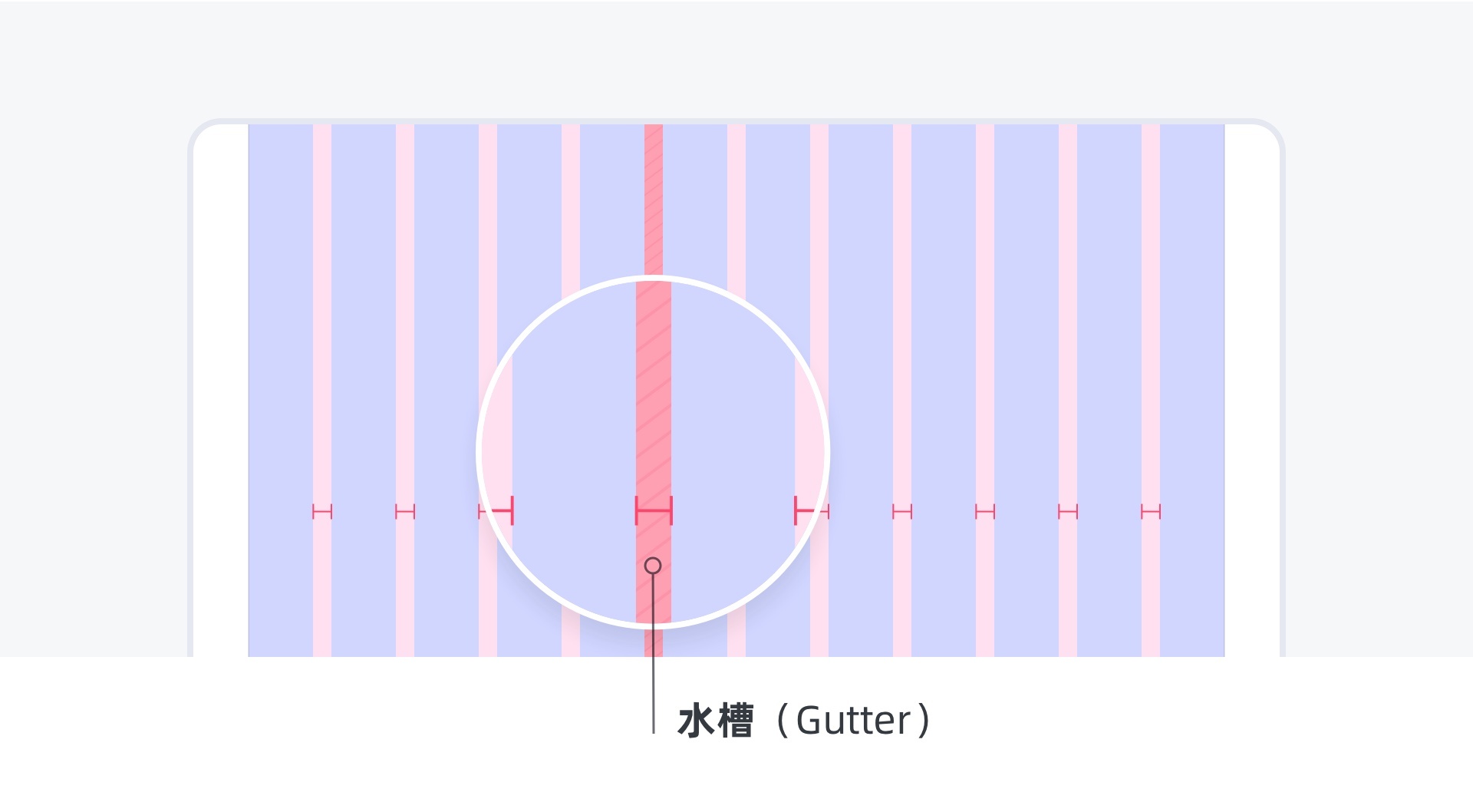
To a certain extent, the width of the sink will also have an impact on the style of the interface. The larger the sink, the more white space, and the better the breath. It is suitable for some easy content browsing page display. On the contrary, the smaller the sink, the smaller the white space, and the compact content. It is suitable for some rigorous tool panel content display. Each has its own advantages and disadvantages. You can weigh the design strategy according to the design objectives.
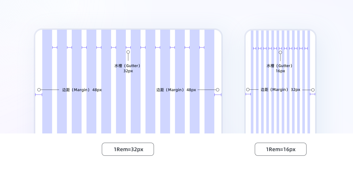
4. Margin
Margin is sometimes called safe margin, which refers to the distance between the design content and the edge of the screen. As the name suggests, it is forbidden to put content within the safe margin, which can be compared to the bleeding concept in graphic design, which is mainly used to control the display boundary of the core content of the screen.
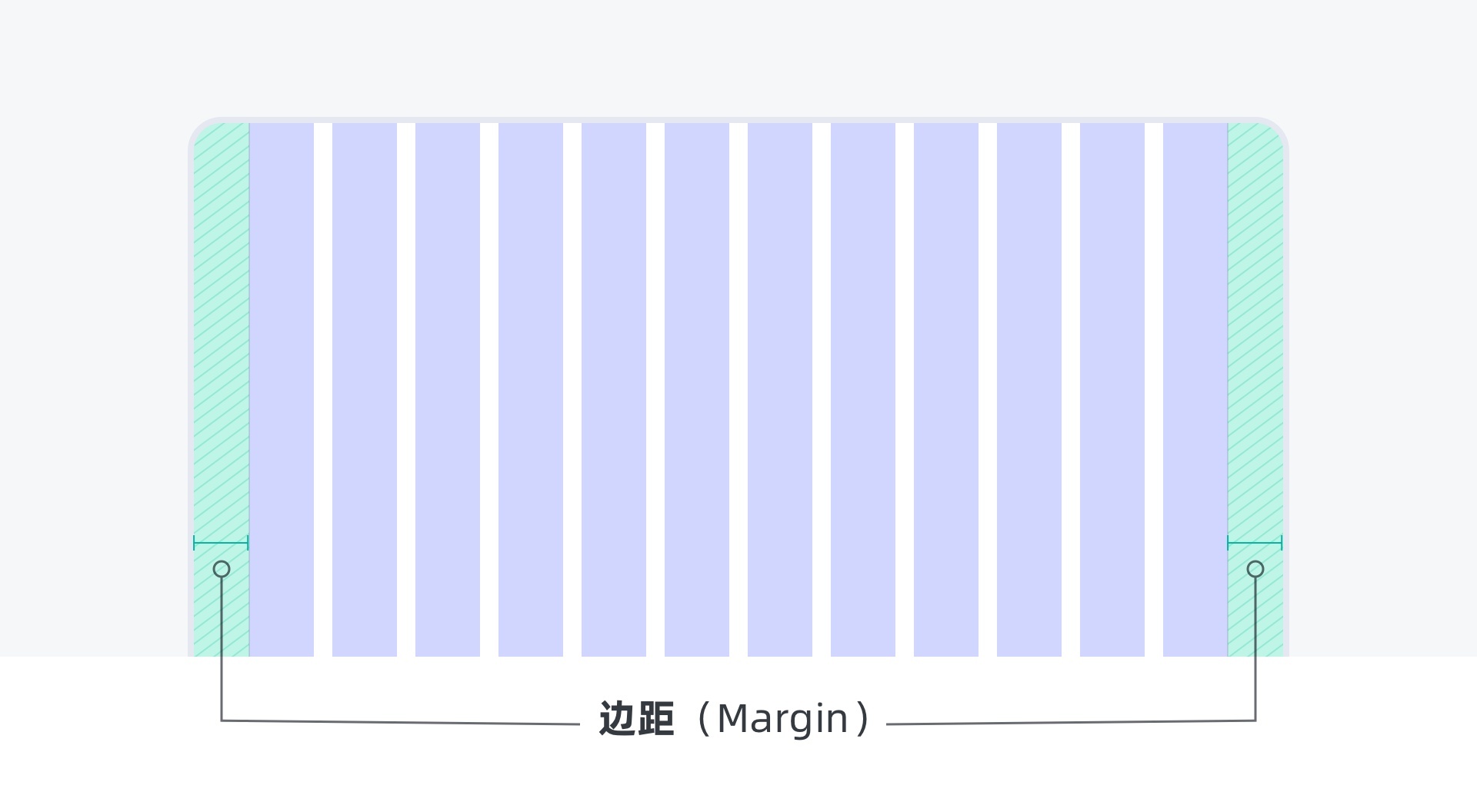
The smaller the margin value, the larger the effective utilization space of the core content of the interface, and the layout will be relatively loose. On the contrary, the larger the margin value, the larger the blank space on both sides, and the stronger the sense of breathing, but the effective utilization area is relatively small, the content layout is relatively compact, and it may also be easily crowded. Here, it is suggested that the margin of the interface can be adapted according to the screen size and respond to changes through breakpoints, which can better ensure that the breathing rhythm of the interface is relatively comfortable on different screens.
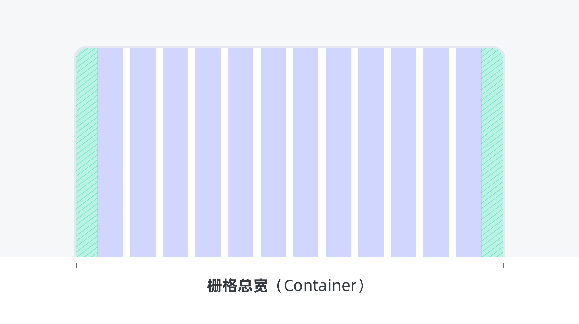
5. Total width of grid (container)
The total width of the grid (container) refers to the total width of the page grid system, that is, the sum of all column widths plus sink widths plus safe margins.
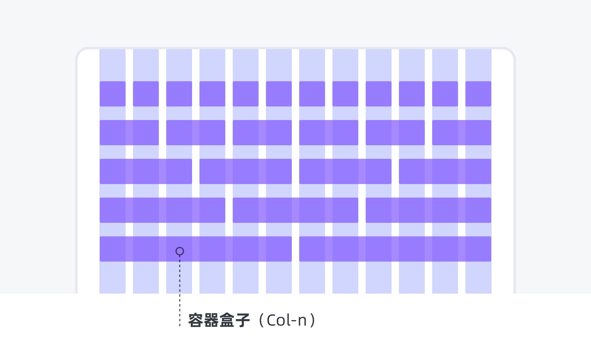
6. Container box (col-n)
After establishing the basic grid, we can define the width of several columns occupied by a piece of content according to the content. We understand this area as a container box, which is used to collect lower level components, or a collection of multiple complex elements such as text, pictures, buttons, etc. according to the page structure, we can combine and assemble them from component - container - module - Page - scene in order from small to large, and finally form the design scheme.
Chapter five how to formulate a grid system
Before defining the grid system, let's get familiar with the calculation formula
If you have understood the function and usage of the previous grid elements, then you can follow the following steps to create a grid system on your own sketchpad.
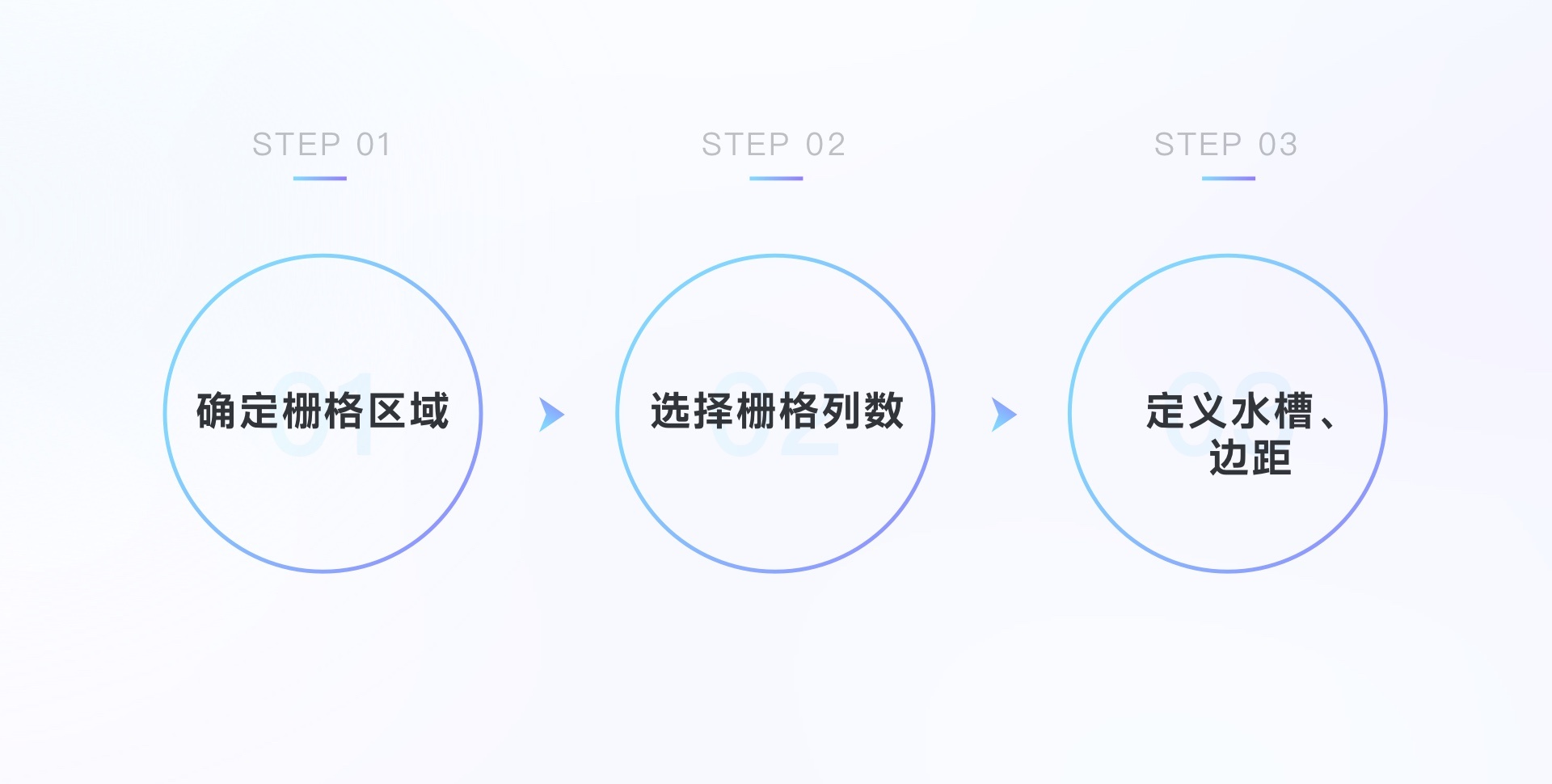
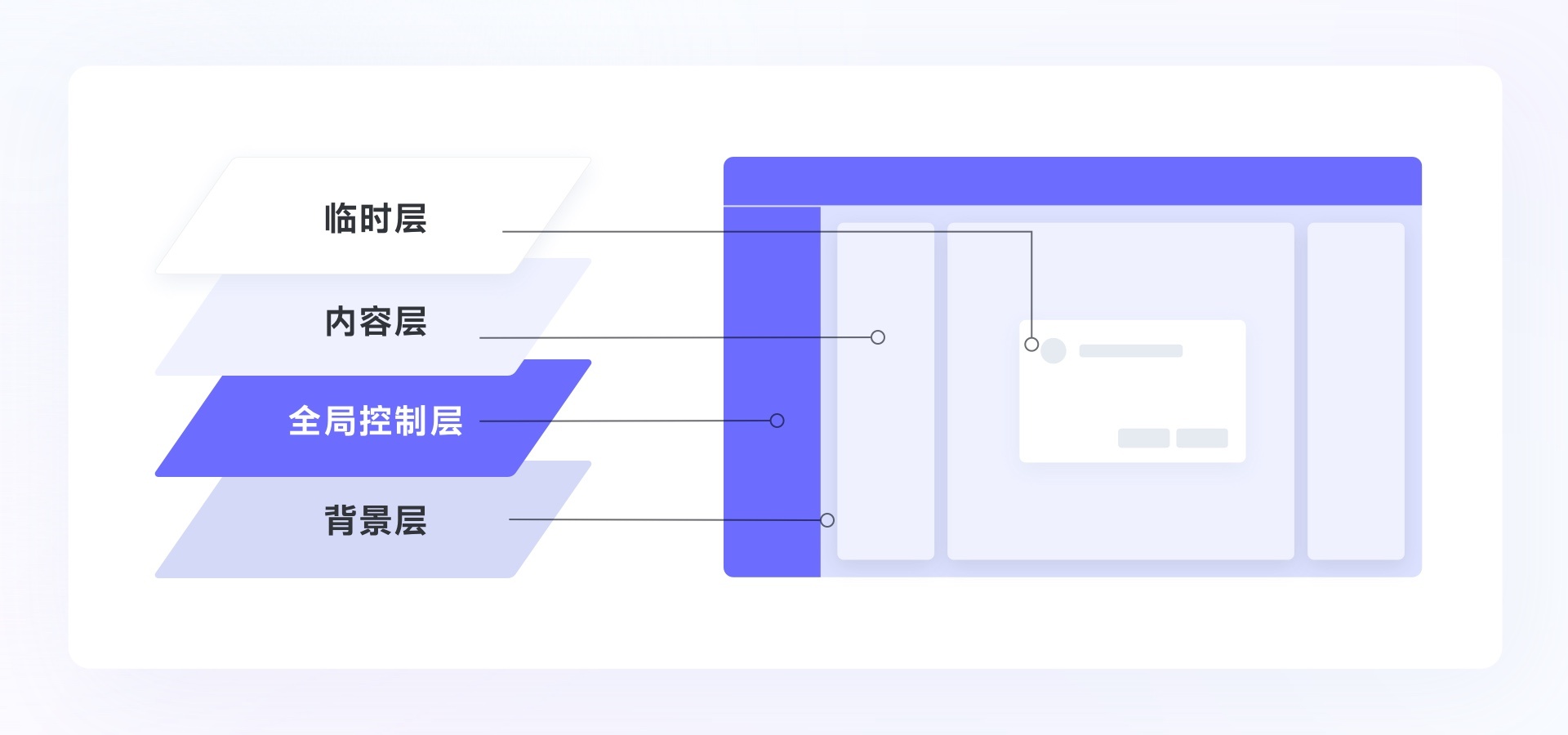
1. Determine the grid area
Note that the grid area is not necessarily the whole area of the canvas. We can first divide the page into global control layer, content layer, background layer and temporary layer according to the functional modules. Usually, we rasterize the content layer.
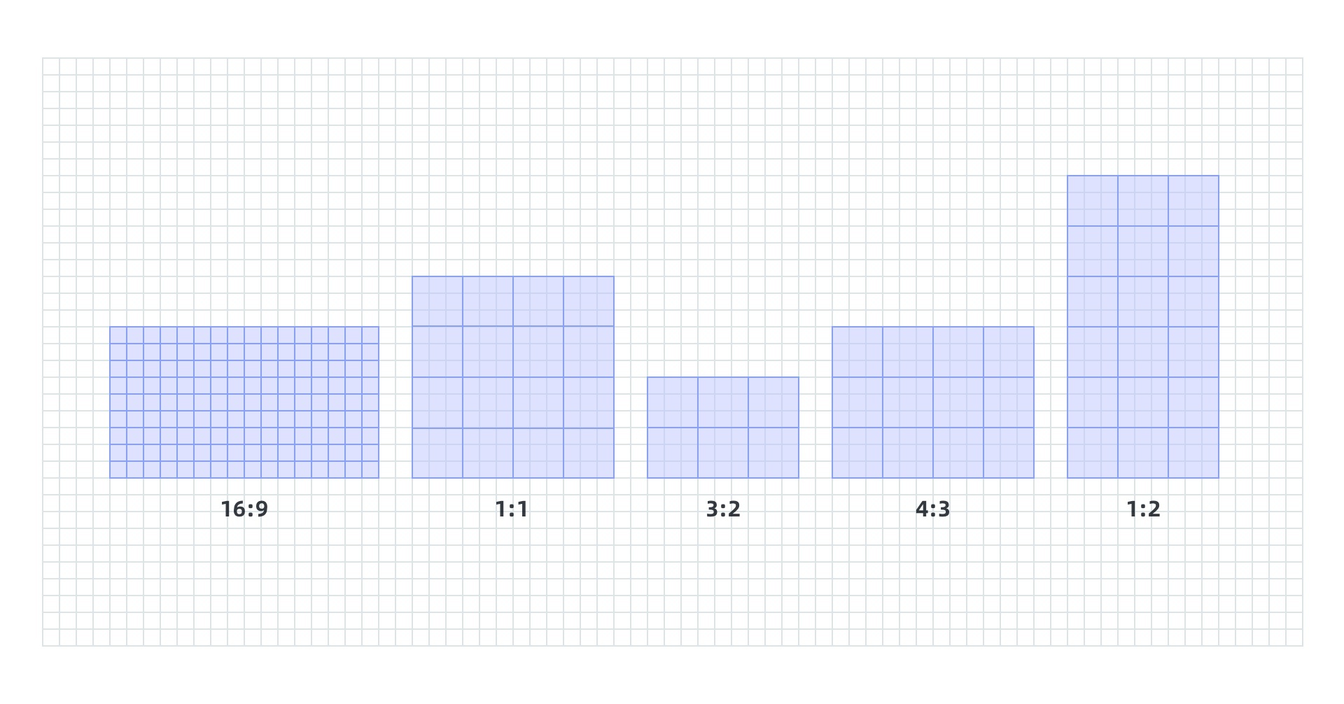
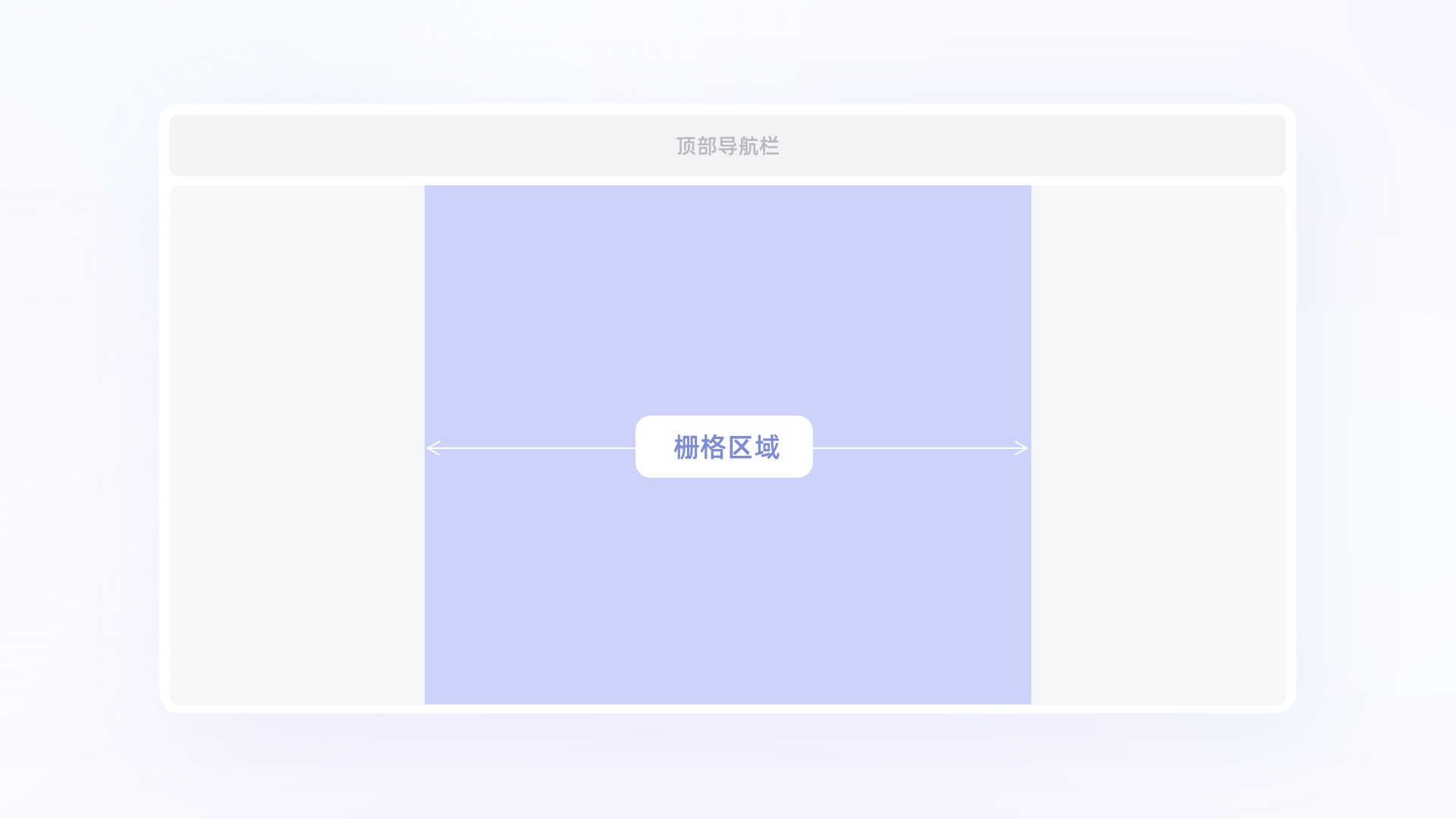
Generally, the three layouts commonly used on the web are shown in the figure below. It is recommended to flexibly select the layout form according to the actual use scenario, and then determine the area that needs to be rasterized.

When we encounter a web-based content browsing website, we generally use the up-down layout, and usually use the 1920 or 1440 size as the design width. However, due to the need to adapt to the minimum size of the mainstream size, the core content display will be controlled at 1024 (here is not an absolute value, different products will fluctuate up and down according to the actual situation), and other blank areas are the safe margins, This is a common adaptation scheme in web pages.
2. Select the number of grid columns
12 grid and 24 grid are common column number structures at present. The choice of grid structure depends on the design requirements of the product. 12 grid: when the product involves multi platform publishing, the content is relatively simple, and the information area in a single container box is large, 12 grid can be considered to be compatible.
24 grid: if the current product is released on PC, with more content and complex functions, a more flexible grid system is needed to standardize the layout of information content. At this time, we can consider using 24 grid. Ant design, the more mainstream enterprise design system in China, uses 24 grid.
3. Define gutter and margin
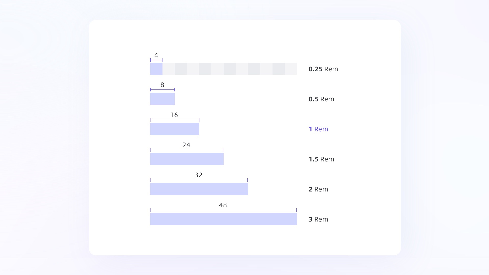
I mentioned the influence of margin value on visual presentation in product UI, so I won't go into too much detail here. Here is a calculation unit called "REM" (REM is a commonly used calculation method for development, and the design and development are based on the same set of principles, which can greatly improve the efficiency of cooperation and reduce the maintenance cost in the process of cooperation). Generally, when formulating the grid system, we can use the value of 1rem to define the gutter, which is the most flexible and can be used as the benchmark value of the grid system. The value of margin is usually 1.5rem or 2rem. Based on the commonly used 4-fold or 8-fold spacing system specifications, the most commonly used basic spacing is 4, 8, 16, 24, 32, 48. We can choose the grid system benchmark value of the matching product from these basic values.
Through the reference value of REM, we can also easily get a matching spacing system. Taking 1rem=16 as an example, we can get the following spacing system:
If you master the above points, you can get a set of grid system that matches the product design requirements.
Application and response of chapter six grid system
Fixed grid
In short, in a fixed grid, when the page is stretched, the size and spacing of elements are fixed. Every time the page reaches a breakpoint size, the marginal content elements will be reduced or increased. Reflected on the grid, when the page width does not reach the preset critical value, the column and sink width of the grid system itself will not change, and the layout of all elements of the page will not change until the critical value is reached. The number of grid columns will increase or decrease with the browser width, and the edge content will be displayed in a new line

Typical cases: dibbble, Behance
advantage:
Simple adaptation rules and low implementation cost
Disadvantages:
The scope of application is small, and the margin in the stretching process is not fixed. Most of them are only applicable to the upper and lower layout products with the middle content
Try to have only one card size for a page, otherwise the margins are not uniform
The card size is fixed, and it is easy to appear incongruous than the column on the screen size that is too large or too small
Flow grid
The page margin and content spacing in the mobile grid are fixed, and the page content changes with the page size, which can be by adding or deleting the number of edge elements displayed, or by adjusting the display proportion of elements. The final effect is to always keep the content card horizontally filled with the available space on the screen. This elastic layout can better adapt to different resolutions reflected on the grid, and the page margin and sink width are fixed, The number of columns is also fixed in the fitting process. The actual column width in the stretching process is scaled by the percentage of the grid area. At this time, the column width is not necessarily a multiple of the minimum unit.
Typical case: Baidu pictures, petals
advantage:
It can be compatible with mixed arrangement of cards of different sizes
The page margins can also be kept consistent, and the transition during stretching is smooth without appearing abrupt
Disadvantages:
When the page expands and contracts, it is inevitable that the card size will fluctuate
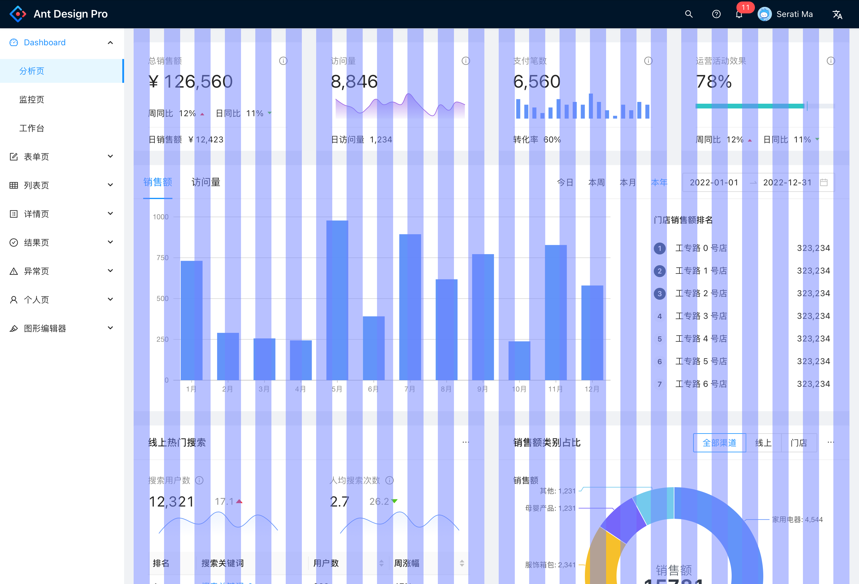
Blend grid
In actual projects, the combination of flow grid and fixed grid is also a common practice. Some background system design and tool based interface design will often make the form of mixed grid. The mixed layout has both fixed content width and flow width, which is more flexible and friendly to products with complex content
Typical case: Ant Design Pro
advantage:
The container has high flexibility in carrying content, and can achieve ideal visual effects under different resolutions
Disadvantages:
Complex rules and high implementation cost
Key points of Chapter Seven grid system
Finally, I will summarize some key points in the use of the grid system:
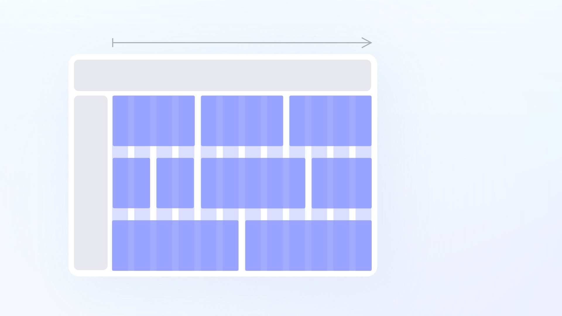
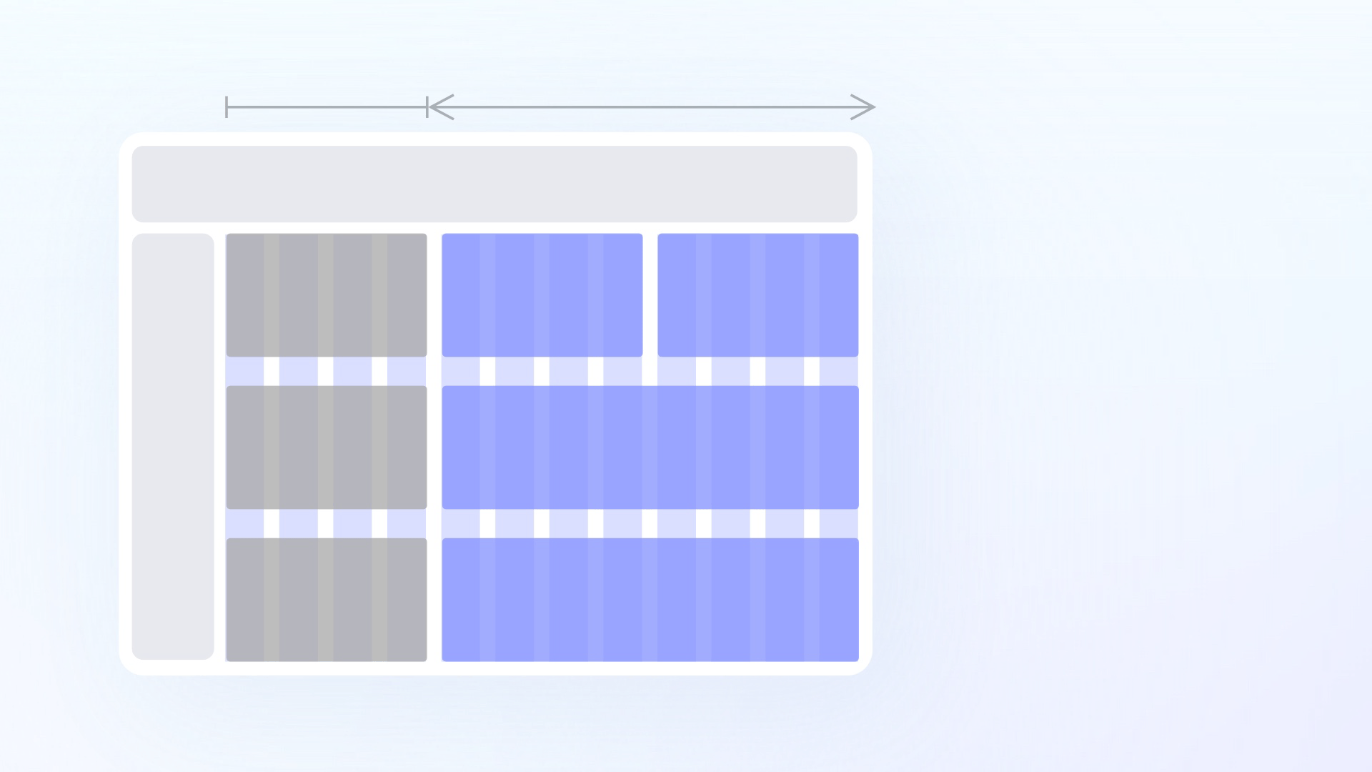
1. The definition of content block should be from the beginning to the end of the column, and it can be divided arbitrarily, such as 6 × 2、3 × 4、4 × 3。
2. It is forbidden to place any content elements in the sink
3. It is forbidden to place any content element within the safe margin
4. Unless specifically designed, do not place elements outside the column
5. As long as the frame (parent) elements align with the grid, the atomic components (children) can not be completely aligned
6. For the area selection of the grid, it can be flexibly applied according to the actual business scenario, not necessarily the entire canvas area
7. Nested grids can be used. We usually use a set of grid standards to globally control the entire interface, but there are some products in which the content density of some typical modules and the matching degree of the global grid are not high. In this case, we can define grid values separately in specific areas and embed them into the overall grid system for combined use.
Concluding remarks
Everything has two sides. We use the grid system to provide convenience for design. The purpose is to better achieve the goal, but not to limit the design. Therefore, in the actual design process, we should carefully consider the formulation of specifications and rules. That's all for the summary of some basic knowledge about grid. Please look forward to [the beauty of order (Part 2)] to share with you the practical application cases of grid in b-end tool products ~
Author: salad
Powered by Froala Editor