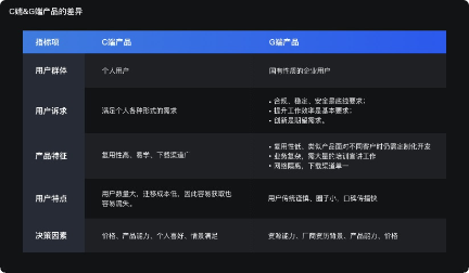
When we watch works, we often feel uncomfortable, but we can't say what's wrong. It's OK. It's normal. You're not alone in this confusion.

I have done many different visual design jobs, such as graphic designer, mural designer, font designer, and even ui/ux designer, but I will encounter similar problems. I used to feel confused and couldn't find a solution. I try to get rid of these ideas by studying, observing and discussing with my colleagues.
Every designer had similar ideas in their early career. Some people have understood it now, but I believe many people don't know it. I didn't fully understand these problems until I was doing font design.
In this article, I want to share my experience as a font designer. This article will be very helpful for those novices in UI and vision, and it will also be a good summary for those visual bosses. Therefore, it is worth reading together.
(there are a lot of GIF motion pictures in the article. After carefully reading the details in the pictures, it is clear and easy to understand.)
1. Why is it obviously the same size, but it looks different?
Why does a circle of the same size look smaller than a square?
Font designers don't design all letters the same height. They will notice the particularity of human vision, so they will use optical techniques to create a harmonious, readable and balanced font.
In the above figure, a square, a triangle and a circle are geometrically equal. However, our eyes think that triangles and circles are small. This is because these three shapes have different weights. In terms of fonts, the number of black is not evenly distributed.
There are two ways to keep them visually balanced:
A. Calculate the area of two shapes and keep them equal
I don't like this method because it only applies to simple shapes, such as triangles, circles, and diamonds. This method is not very effective for complex visual effects.
B. The simplest way to test visual weight is to make the size larger, exceed and blur the shape
- 1) Make non square shapes larger (triangles, arrows, dashes, linear icons, etc.)
- 2) Exceeds the circular bounding box in the icon specification
- 3) Blur the figure, for example, add Gaussian blur, compare the size of the generated visual spots, adjust to the same size (mainly to see the size of the blurred edge), carefully observe the following figure, and compare the effect.

Now you should understand why non square / icons look smaller than squares. Let's see how real icons and UI elements can become better using these optical principles.

When designing a complete set of icons, it is crucial to ensure their balance. To maintain balance, leave extra space between the icon backplane and the icon area, and allow non square icons to exceed the icon area.
Another example is a rectangular UI element with a circular button. If the height of the round button is the same as that of the rectangular UI element, the round button will look smaller. Based on the principle of optical correction, you need to treat these two elements differently.
Take a look at the following examples, WhatsApp, Samsung news, and swiggy support chat. Which one do you think is more correct? Please post your opinions in the message area.

2. Why does it always look not too round?
Is there anything more square than a square?
Our eyes have strange visual perception, and what we see is different from reality. The following is a similar test. Which circle and which side do you think is more standard?

Among these ellipses and rectangles, one is a circle and the other is a square. I have modified the correct ones, but they seem to be more symmetrical, because of the vertical horizontal illusion. (Caiyun note: the right side is adjusted, which looks more rounded and corrected)
Most geometric fonts are not geometric shapes. Font designers design high-quality fonts by keeping in mind human visual perception. They use optical principles in almost every letter to keep the font balanced.
You should know what I mean from the above test. To learn more, please see the pictures below. I put the letter "O" next to a perfect circle from the geometric font Futura. Which one do you think looks more symmetrical?

You guessed it even before the bottom text appeared, didn't you? The letter "O" from Futura is wider than the perfect circle, but it looks more symmetrical. The reason is that our eyes tend to see vertical areas longer than horizontal areas, even if they are the same.
Let's see how this illusion appears on the letter "t".

In the above figure, the thickness of horizontal strokes is smaller than that of vertical strokes to avoid illusion. You can use this technique when designing square icons, square backgrounds, or avatar borders.
3. Why does this fillet look hard?
How to drive as smoothly as possible?
Designing Fonts is like driving a car. When we drive, if we are already at the beginning of the curve, we will not turn the steering wheel, but make a natural turn before reaching the curve to avoid accidents.
Font designers do not rely on the preset radian of graphic editing software. They adjust the curve to make it smoother, because they know that the human eye can immediately notice the point where the straight line suddenly becomes a curve.
Let's look at these two kinds of curves: pure geometry and fine tuning. Try to observe which one interferes with your eyes and which one is smooth.
Let's see where we can integrate this learning in UI design.

You may have noticed that the buttons, icons, and frames on the right look more pleasing to the eye. The curve on the left has a hard transition from a straight line to a curve.
How can we correct the curve? During design, you can enter the shape editing mode and manually adjust the size of the curve handle, as shown in the following figure.

4. Why does the same spacing look messy?
Why is eye judgment more important than numerical parameters?
Spacing is the most critical part of font design. The font designer combines the letters according to the shape of the letters, and arranges the letters at different intervals. For example, the letters A and V are triangular and contain more external white space. Therefore, if they appear together, the spacing between them will be a little wide, and the spacing needs to be reduced. This helps to form a harmonious font.

Font source: EK Mukta, by Dr. Girish dalvi and yashodeep gholap
Now, let's see how to apply this knowledge to other aspects of visual design. You may have noticed that placing a triangle icon in a circular or rectangular container will make the icon appear incongruous. This is only because when the container is aligned with software, the area of the triangle is not equal on both sides. Look at the picture below, you can understand it with visual explanation.

In order for the triangle to have an optical center in its container, we need to balance the weight on both sides. For triangles, you can find the centroid and align it with the center of the container. Now, if the triangle is created with the shape tool, Adobe Illustrator will provide a prompt for the centroid.
If you don't see the centroid prompt, don't worry. The centroid can be located by simply drawing a line from the center of any two edges to the vertex opposite them. See the picture below to better understand it.

This method is only applicable to geometric shapes. For other more complex shapes, you need to rely on your eyes rather than mathematical parameters.
Keep in mind that if you cut a picture for a developer, you need to leave some areas around the icon so that they can place the icon in the center of the background.
Draw a circle from the centroid of the icon, leaving an extra area around it.

Let's check. We can discuss which company used the wrong resources in the message area?

5. Obviously the same size, but it seems top heavy?
How to balance?

Have you paid close attention to the letter "B"? Its bottom is designed to be larger than the top. If the two semicircles we designed are mathematically equal, it will look unbalanced (check the left figure). This is because we have evolved to deal with the physical world from the concept of "perspective", in which distant objects look smaller than nearby objects. (Caiyun note: it can be understood that when you are at the foot of the mountain, the objects at the foot of the mountain are larger than those at the top of the mountain. Perspective principle)
In printing, this means that to make the font equally balanced, you need to draw more weight at the bottom.
Let's see the obvious difference by flipping a few letters in the font.

Font source: EK Mukta, by Dr. Girish dalvi and yashodeep gholap
The same concept applies to other horizontally symmetrical letter forms, even when the cross bar of the letter "H" is placed above the actual center, making it look more balanced.

So the next time you design a horizontal icon or logo, use this bottom heavy technique to make it more visually balanced.
6. Why does it always look misplaced when it is clearly on the same line?
This illusion, also known as the "Poggendorff illusion", is a strange phenomenon that distorts our perception that the intersection angle of shapes is not 90 °. For some reason, it is difficult for our brain to infer a line covered by other shapes, resulting in the interruption of continuity. To better understand it, first look at the left figure in the following example to see which line is continuous, a or B? Then check the picture on the right of the cover line that I narrowed down. I hope you understand what I mean.

In Latin fonts, 'x' or 'x' is the victim of this illusion, which needs special treatment to make it look more natural. The font designer offsets the diagonal slightly to correct the optical effect of X or X. (Caiyun note: the right side is adjusted, which is visually more continuous)

If you encounter similar problems when designing fonts for other languages or icon sets for apps, you can try to offset the slash as in the letter "X".
summary
The difference between senior designers and novices lies in the details. The biggest confusion for novices is that they can't see the problem and don't know how to refine it. Caiyun didn't know these details when he was a novice, so I hope you can learn them.
The above six are the visual details that often confuse designers. Before, I always thought that what was made with software must be right. Now I understand that vision depends more on the designer's own eyes. After all, these works finally depend on the user's eyes to experience.
Powered by Froala Editor