Come on, come on!
I haven't seen you for a few days. I'm here again with an update~
The "variant" launched this time has raised the practicability of "real-time design" to another level, and it is easy to operate. The efficiency of design can be doubled easily!

Ah? Don't believe it?
Let's recall carefully how we used to replace reference components ~ can we only screen out a large number of components like this

Every replacement is very troublesome, especially after there are many referenced components in the project, it's a disaster to find them!
Now -- let's feel the effect after using "variant"

These can be done in the design draft~

What about? Are you suddenly interested in "variants"!
In order to do this function with extremely complex logic, our little programmer has a big head! I promise. Once you use it, you will never leave it~
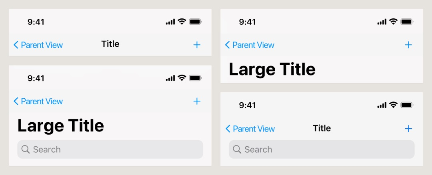
What are variants
Combining multiple reference components (symbols) into a whole, you can switch different states of components at will by setting properties, which is a "variant".
After using the variant, all component replacement in the design process will become as simple as operating the app!

In short, this is a very designer friendly function. It also has many excellent features, which will even completely change the way you use reference components!
There is no limit to the number of components, and one click switching in any state
Some friends may say:
"There are only a few components you demonstrated above, but there are hundreds of them in my project. Can they be used?"
Of course, the answer is no problem. In "real-time design", no matter how many reference components of the same type, you can select them all and merge them into variants at one go!

After the merger, designers only need to classify components freely according to their own ideas and types, colors, functions and styles. Even if there are dozens or hundreds of components in the final variant, we only need to take out one, and the rest can be switched in the right panel. There is no need to replace them manually repeatedly.

Reference components are merged and sorted, which is more convenient to drag and drop
When there is no "variant", we want to use the components in the resource library. After searching for keywords, we need to distinguish from a large number of components and drag them to the editing area. When other components of the same type are used, we must find them again.
After the reference components are merged into "variants", there will be only one variant left in the search results in the resource library. No matter what state we want to use, we only need to drag this one to the editing area.

The variants dragged out are directly in the form of "instance components". You can copy as many as you want. You can select what state and style you need in the classification on the right panel~

It supports uploading personal resource database, which can be directly used by other projects
And the personal resource database we have to mention! In sorting out design resources, it really has irreplaceable advantages over other tools.
All "variants" such as navigation, buttons and switches you have designed are the same as existing components and materials. You can right-click "upload to resource library" after selecting them.

In this way, no matter which variant is needed in any project in the future, it can be dragged from our personal resource library for direct use without re creation.

We can even share it with the whole team through our upcoming shared design library to establish a common variant specification! At the thought of these, I feel I love this function more!
All right! That's all for the update of "variants". Finally, let's use a small example to show you how to get started quickly~
↓↓↓
① We first create three fillet buttons with different radians, copy a modified color to distinguish, and then create the six buttons as reference components respectively;

② Select the 6 reference components that have been created, and click add in the variation panel on the right to merge them into variations;

③ Select "variant", add a new category of "clickable status" through the options in the upper right corner, and right-click the automatically generated "category 1" to rename it to "fillet radian";

④ Select multiple corresponding components, and name the value of clickable status as "yes / no" and the value of "fillet radian" as "5 / 15 / 25" respectively through the input box on the right;

⑤ Select any reference component in the variation, press and hold alt, drag and copy to the editing area, and you can select the switching state through the right panel.

What about? Does it feel very simple and convenient?
Of course, this is only a very basic usage. We have also prepared a very detailed tutorial for you. Before you start, you can check the complete documentation in the help center on the official website~
(copy the link and view it in the computer browser)
https://js.design/tutorial/#/content/1.Guide/19.Variant
No matter how much you say, it's not as good as me. Moreover, such easy-to-use functions must be experienced in "real-time design". I believe there will be variants in every project in the future!
————————
Welcome to join the wechat communication group of "instant design" and submit your experience and daily functional requirements to us. Maybe you will have the functions you want in the next update~

Scan code to join wechat communication group
Welcome to the immediate design of the official account, and get the latest trend of "real-time design" and free design resources for the first time.

Powered by Froala Editor