preface
With the rebound of the global epidemic, many foreign cities have extended the closure time, and large foreign factories have successively implemented remote office, which undoubtedly magnifies some problems in teamwork. Especially when using sketch, there are always pain points of multi person collaboration and version management, and working from home may encounter cross terminal and preparing materials in advance. In my own case, for example, there are only PCs at home and no fonts and materials are installed, which have become one of the biggest obstacles to telecommuting.
It is understood that more and more large manufacturers such as Microsoft, twitter, dribbble and airbnb abroad, byte beating in China and some departments in Netease are beginning to use figma as a team design tool, and the annual survey report on uxtools user experience tool shows that figma has a gradual upward trend abroad.

Screenshot source: https://uxtools.co/survey-2020

Taking this opportunity, I tried figma and found that it is a cloud collaboration model. This is a very forward-looking design! Previously, Gartner, a market research institution, predicted that by 2023, the scale of the global Internet communication cloud market will double that of 2020 to US $13.35 billion. The landing of cloud games and telemedicine is also enough to see the future prospects of cloud services. What are the advantages of figma in addition to its forward-looking and powerful cloud collaboration capabilities? Can this software replace sketch?
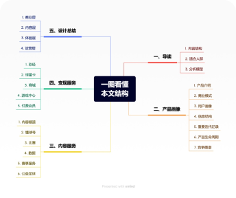
This paper will compare and analyze the advantages and disadvantages of the next two software from the perspective of a UI designer, and carry out detailed evaluation on components, teamwork, compatibility, migration cost and so on. Let's have a look~
Note: components in this article refer to UI elements that can be reused in your design. They can help you create and manage a consistent design across projects. The common steps are ① first create the main component and define the properties of the component. ② Then create an instance of the main component. ③ When the main component is updated, all instances of that component are also updated. Therefore, as a component summary of description documents, that is, components that do not meet the third point are not within the scope of this article~
1、 Drawing efficiency
Many teams may think that components are used to unify the visual norms of students, and interactive manuscripts do not need to meet the norms, so interactive students do not use components, and the learning cost of components is too high. However, as a qualified efficiency tool, component library is easy to use and improve efficiency should be its index. Here, we focus on the comparative analysis from four aspects: efficiency, easy to understand, simplicity and safety.
1. Flexible and efficient
In this part, we will gradually analyze the differences in efficiency and flexibility between sketch and figma from the four steps of ① starting the software → ② finding components → ③ covering instances * → ④ editing instances.
*An instance is an exact copy of the master component and is controlled by the master component. It has all the same attributes as the original attributes, including any text style, style, or layout constraints.
1.1 fast software startup
If sketch installs too many plug-ins or opens too many files, it is easy to cause flash back or no response. Even if it can be reopened after flash back, it will lose data from time to time. The previous figures are made in vain (energetic. JPG). I use figma, which has not flashed back so far. I start the recently opened files in seconds, and save them automatically all the time. When making a map, I won't be interrupted. It's both reassuring and easy!

1.2 multi view flexible search
In this step, figma has two views: list and grid, which can be selected by users to meet the needs of different viewing components. Sketch only supports list viewing, and components such as icon are very difficult to identify from the thumbnail.

1.3 low threshold of coverage instance
We usually have some list pages when drawing, such as paying attention to the user list. After dragging a list instance, we need to modify the nickname and avatar in batch to simulate the high fidelity style. When sketching fills materials in batches, the same instance must be selected, while figma only needs to select the layer. As shown in the following figure, both are batch modification avatars. Regardless of the size of the avatar and whether it belongs to the same component, fig can be replaced with one key after selecting the layer. The material filling threshold is very low and the efficiency is up!

1.4 few steps to edit an instance
In this part, we will use the pop-up component to compare the two software ~ pop-up components, also known as dialog, which is one of the most basic and common components in app. The common components of pop-up include feedback icon, title, text, auxiliary text and generally 1-3 operations.
Some pop-up windows are the feedback of the operation of the upper level, and you need to add the icon of whether the operation is successful or not. It is also the operation of hiding icon. Sketch needs to click to enter the secondary editing menu first, and then select hide. There are two steps to complete, while the sigma entry is shallower and only needs one step.

This is because sketch does not divide the editing behavior according to the editing frequency. Both "display" and "switch components" are included in the secondary entry.
Figma is classified as follows: one type of information is "must be displayed", such as operation items. The user only selects the number of operations: single button or double button. This type of information must be displayed is placed at the primary entrance; One kind of information is "not necessarily displayed". Put the display switch at the primary entrance and switch the components ¹ At the secondary entrance. In this way, the display is graded according to the category, which makes the level more flat and the operation more convenient.
1. The "switch component" here refers to switching the content displayed by an element under the current pop-up instance. The whole component is not replaced, the same below.
Small tips: in addition to the above methods, you can also directly select the layer and click delete.
Sketch editing components are carried out uniformly on the control page. Users need to switch with instances. Figma can edit directly on the current page without skipping the page, which is faster and more intuitive.

Continue to take the pop-up window just now as an example. Let's list the edit points of each line in the component and compare them one by one ~ except for points 3, 5, 7 and 8 grayed out in sketch, each point can correspond one by one. What do these gray points represent? How did figma handle it?

We found that the grayed out points are all text editing operations. The fig in the left figure designs it on the component and can be edited by double clicking the text layer directly. Although sketch also uses this function for reference, it does not cancel the edit menu on the right, resulting in dense information line by line like the picture on the right, and the interface is naturally not so concise and refreshing.
2. Easy to understand and easy to use
In the previous part, we mentioned that the editing interface of figma is more refreshing. Will it increase the difficulty of understanding?
Figma adopts a result oriented description of edit points: is there an icon? Is there a text? Is there any auxiliary text? What is the number of action items? These words are easy to understand even for new students who have never used components, and they can also note the use of specifications to assist instructions. Moreover, the above edit points can also be customized according to their own business. Even if each team has different naming habits for components, there is no need to worry.
Sketch needs a double understanding: component principle and editing order. Let's analyze how figma does it based on these two points~
2.1 there is no need to understand the principle of components
As shown in the figure below, figma shows three edit points as shown in the blue text below through the exhaustive example of variant * function: select operation quantity / whether there is text / whether there is icon; Sketch exhausts a single component, showing 8 edit points as shown in the black text on the right of the figure below. As a result, sketch shows a lot of editing points everywhere. Users don't know how to edit to get the desired style, whether to switch components, modify icon color, or edit text. Without understanding the principle, the relationship between edit points and styles cannot be established. Such a high learning cost was directly discouraged.

*The original name of the variant component is variants, also known as component set / super component. It is a new function released by figma on October 28, 2020. Let's see the official explanation. To put it bluntly, a variety of types, sizes and states of a single component are enumerated and classified according to this (as shown in the blue word on the left of the figure above), and finally assembled into a component assembly, so that it can quickly select and switch by category through the edit menu on the right (as shown on the right of the figure below) to obtain the final style.

2.2 there is no need to understand the editing sequence
The component layer order of sketch is equal to its editing order, so whether sketch is good or not depends heavily on its creator. Once the layers are not organized, the editing order is easy to be confused. Users must first straighten out the corresponding relationship between components and editing order, which increases the starting cost and reduces the efficiency. Figma does not have such a problem.

Sketch needs to understand both the principle of components and the editing sequence. In addition, its component name is very long, which is very boring to read, which makes novices flinch. Flash at that time, in order to solve the boring problem, Emoji was added to improve the recognition to distinguish between switching components, whether to display, edit text and other functions, but the symptoms were not the root cause.

2.3 prompt words can be added to components
A prompt can be added to the component to intuitively tell the user how to use the component in the instance and relieve the user's doubts. Moreover, it can be written as some nicknames of components, so that it has the function of fuzzy search. For example, some search icons, which we may call "find", "search", "magnifying glass", etc., can effectively improve the accuracy of search after adding prompt words.

At the same time, it can also add links, which can be a detailed description of the components, some inspiration resources, some videos and other expansion materials, or link to another sigma file. Help product or development better understand our original design intention and concept, and maybe promote them to realize it according to this concept.
Note: when viewing, be sure to select the component, not the layer in the component, so that the link can appear.
3. Concise and organized
3.1 refreshing interface
The following figure shows the editing status of pop-up window in sigma and sketch. After selecting a component, the editing interface will appear on the right side of the software as shown in the figure below. Obviously, the number of layers in figma is much less. The single line text is very refreshing. There are not so many dense words. It can show more editing functions and even add component prompts.

From the screenshot, we can see that the sketch is arranged alternately through "one line copywriting description" and "one line filling or selection", resulting in a large number of lines on the editing page and a very long vertical. The more information, the higher the cost of obtaining information and the lower the efficiency.

Not only is it very long vertically, but also the name of a single component is very long horizontally. If the target component cannot be found on the current page, you need to search or find the more information intensive general component library. This is because sketch organizes components in a cumbersome way of "/" naming. Although sigma also supports "/" classification, it adds one new point: it can use page and frame / group without appearing on the component name, which means that the name is shorter and doesn't bother to look at it.

3.2 category editing
Another key reason why figma is concise is that its components are more atomic. The editing behaviors of components are classified: component combination mode, color style, text style, opacity, component switching and other behaviors are separately controlled and not mixed with each other. When we need to change the color style, we don't need to go deep into the components like sketch. Let's take the pop-up window as an example and take a look at the figure below.

When the information is classified, the speed of finding information is naturally fast and the efficiency is also up.
4. Version traceability
All versions can be traced back to the first draft at any time!
Figma has the function of automatically saving the file. If the file is not changed within 30 minutes, it will be automatically saved as a version. This means that if you work on a file for 3 hours and then stop editing, a version will be created after 30 minutes of inactivity. You can also actively create a new version by pressing the shortcut keys command, option, s (Win: Ctrl, alt, s). When naming or saving the version, you can also add a title and description, which is easier to identify when you want to retrieve the first draft.

2、 Teamwork
1. More accurate delivery
If the sketch has a new function and the third-party software is not updated synchronously, the following bug will be caused: after the design draft is uploaded to xshow (similar to blue lake), the icon color value is displayed incorrectly. On the left is the icon style, in the middle is the correct color value of sketch, and on the right is the wrong color value after uploading to the third-party software.

In fact, this is because sketch has a new "hue" function, which can directly overlay a new color on this layer. However, xshow is not updated synchronously according to this new function, resulting in the color value of the original drawing layer being displayed when it is delivered to development. I have also tried to stretch the component in equal proportion in sketch. Although the outer contour dimension of the component is an integer, there will be decimal points in the elements in the third-party software component, resulting in the development according to the wrong spacing. This problem will not occur if figma uses the original software source file from drawing to delivery.
2. Faster delivery
Save the time of uploading to the third-party platform or exporting, WYSIWYG.

3. Progress synchronization
Because the figma files are in the cloud, you can always check the design progress, break the information gap, and it is more convenient to control the project progress globally.
4. Immediate comments
Anywhere in the design draft, feedback modification suggestions with upstream product & downstream development through comments, and even @ others in the comments or mark the comments as resolved.
5. Multi person creation
Support multiple people to create together. Because figma is developed based on the web platform, the software can be updated automatically without the problem that multiple people cannot cooperate because of different software versions. Is it convenient for many people to complete creation in different places at the same time and at different times without transmitting and modifying files back and forth?
3、 Component management
1. The number of components is more streamlined
Using the function of separate control of figma style, there is no need to add components due to different colors! There is no need to add new components because the text is centered on the left!

Variant components are designed to reduce the number of components! It is also a avatar component. The variation of figma will unify the number of components, while sketch needs to be listed and displayed.

2. More convenient style management
The first point mentioned that the text style is separated and controlled separately, the layer style is reduced, and the color projection fillet and other styles are also based on this principle. After selecting the layer, the used colors will appear on the right, which can be directly managed in batch, eliminate the color values that do not meet the component specifications, or re link the broken components in batch (i.e. lose the link with the component library), which is not easy to be missed.

3. One click iteration of component library
Component libraries are often updated and iterated according to business needs. At this time, how can the instance file synchronize and iterate with the component library? Sketch needs to open synchronization components one by one to keep consistent with the latest component library. When there are too many files, this operation becomes extremely cumbersome. Figma is controlled by a switch, so that one modification can change everything. Moreover, the updated variant function is more convenient for component use and iteration.

4、 Compatibility considerations
1. Assets and people
Files, plug-ins, materials and fonts all follow the account. There is no need to worry about temporarily changing the terminal and spending a lot of time preparing these materials.
Files do not occupy local memory, and there is no need to buy high-value shared network disks within the team. There are also many plug-in introduction articles on the Internet, which will not be carried out here. There is a tool strongly Amway to give you: a plug-in visualization to facilitate the search and quick start of gadgets!
Official explanation: figma ex is a tool used in figma to visualize the list of plug-ins, and provides functions such as "customize and modify the display order of plug-ins" and "Chinese Notes". It is a blessing for patients with severe plug-ins! And all client browsers support it. Please see the figure below. Official website link https://moonvy.com/FigmaEX/

Materials can be managed by the plug-in "concentrate reel". Unlike sketch, which needs to pull avatar or nickname text materials locally, the concentrate reel plug-in contains a large number of online materials to choose from, including name, e-mail, company name, website, personal data picture and so on. Of course, you can also upload some materials for the team to facilitate everyone's use, so as to ensure that our design draft is more high fidelity. In the figure below, there are also some recommended materials that you can collect and use.

The threshold of font and account is slightly higher, which requires figma Enterprise Edition. It allows users in the organization to access and use shared fonts within a specific team or the whole organization. In other words, all the fonts I have used can be displayed correctly on other computers.
2. Any terminal
Figma can be used in any system because it is browser based and does not rely on drawing terminals. Windows, IMAC and even mobile iPad can make pictures, which can be described as the hegemony of the whole platform. For iPad mapping, it is recommended to download graphical software. It is packaged into software with a browser, and has an excellent experience with magic keyboard, touch pad or mouse. Sketch can only be used on MacOS now, and many teams have to buy expensive Apple office equipment for this.
5、 About migration
1. Is the migration cost high
Learning cost: the learning cost is low. The two software interfaces are very similar to shortcut keys. The installation of Chinese plug-ins is particularly easy to use.
Capital: two person team is free.
Time: figma can directly import sketch files. At that time, I was familiar with the software. It took me four working days to import all visual draft files. The time to import the manuscript should be about a day or two.
2. Best migration posture
Can be imported directly: text, color, empty status, occupation bitmap, icon and other materials can be imported directly, as well as avatar, separation line, fillet and other materials with only standard size gears. Such components basically do not use the characteristics of software, so they have low dependence on software.
Auto layout layout constraints need to be added after import: Operation bubble, action sheet, drop-down Filter menu, etc. layout constraints need to be added in sigma. Such components often have a large number of duplicate lists. With the layout constraints of figma, the number of columns can be added or deleted arbitrarily in the instance to meet the personalized needs of the business.

It is recommended to make variants: buttons, switches, pop-up windows and other components with multiple types / states / sizes. The core of variant component is the component used to efficiently manage multi state attributes. For example, many instances can be extended through the change of small elements. If they are not assembled into a variant, it is easy to cause the redundancy of components, laborious search and cumbersome operation. However, I suggest that the property variable should be controlled within 5, otherwise exhaustive will make the variation very large.
6、 Relevant recommendations
Here are some learning websites I often use~
Official help: https://help.Figma.com/hc/en-us
User manual in Chinese: https://Figmachina.com/guide/
Version iteration Description: https://releases.Figma.com/
Figma plug-in visualizer: https://moonvy.com/FigmaEX/
Recommended up at station B: straw hat SMAO, pixel fan
For more ideas, discoveries or doubts, please comment and leave a message.
The copyright belongs to the author. For commercial reprint, please contact the author for authorization. For non-commercial reprint, please indicate the source.
Powered by Froala Editor