Hello, I'm Jack. What's the hottest punch in tourist attraction recently?
There are many Beijing Universal Studios. Do you often have buddy videos? Megatron, Harry Porter, Transformers, Xiao Huang people, etc.
The Universal Studios, which are built in the past 7 years and cost more than tens of billions of dollars, are known as the largest amusement park in the north. They have seven major scenic spots, including the Kung Fu Panda's world, Transformers base, Xiao Huang Ren Park, the magic world of Harry Potter, the Jurassic world, the Hollywood, and the future water world. Meanwhile, there are 37 recreational facilities and landmark spots. And 24 performances, and this is China's first universal studios.
My favorite is the Harry Potter scenic spot. There are many magic interactive elements. I can watch the light show at night. It's very beautiful.
The buildings in this scenic area are very distinctive, and there are many fun props. When tired, you can go to the outdoor magic store to bring some small gifts to your friends.
To get back to business, all my friends know that I am a game R & D art and a UI tutor.
Today, we bring to you the latest game of Harry, Potter, which is the latest game launched by the old NetEase. The online game and the Beijing Universal Studios opened in September. I believe this is not a coincidence. It is fate.

The "Harry Potter" magic awakening project was initiated and developed in 2017 by the art director: Song Peng; Art Manager: Ma Yaguang is in charge. This game has been developed and polished for more than 4 years. The quality is excellent. Let's take a look at the art screenshots and dynamic effects of the game after it goes online with ah Jie.

App-icon is a classic hero
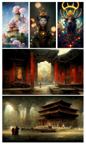
Original game painting:
Pay great attention to restoring the content and characters of the game. When you see these settings, you have a feeling of wanting to play. The picture is also very friendly, such as watching an animation.


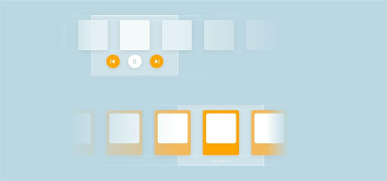
Game UI interface:
The whole game pays attention to the movie plot, will experience many events, and then will obtain many skills and monster cards, and unlock some new functional systems one after another; The whole playing method inherits the consistent game characteristics of Netease and fights through cards or skills. The playing methods of similar online games are similar, but the artistic performance is different. The picture is generally a top view angle of 2.5D or a head up angle, so the experience is better and the fighting vision is broad.

The game art quality and style of the pig factory are the biggest attraction and selling point. Compared with the goose factory, we have no flow channel and can only impress consumers through good game quality. In order to improve the art, we have not worked less in research and development and been scolded. It can be seen how strict the boss is on the project.

It is normal for us to modify the design draft more than ten times at a time. This is what our art designers value. After all, our job is to do a good job in visual design. For example, in the island era project participated by ah Jie above, I have modified each of the two optimized interfaces more than 10 times before they are basically finalized to the satisfaction of the producers.
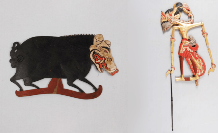
Harry Potter game design
Key words: magic, quasi materialization, sense of space, sense of history, dynamic effect of light and shadow
Design carrier: books, cloth strips, patterns, ink drops, cards
If you look carefully, you will find that these design carriers I mentioned above run through the design of the UI interface and icons of the whole game. Many interfaces have magic books and magic related props, and here also restores the background of the novel story.


Dynamic effect appreciation:
With the development of art, in recent years, major game manufacturers have high requirements for quality. At this time, UI design has reached the ceiling. So, how can we better break this height? The answer is to make the design move! This is more interactive and tension than a static picture;
Therefore, stories, fun interface design and player interaction are easier to win the hearts of consumers, and the evaluation score is also high.
The most important thing in this game is cards. Let's take a look at the dynamic effect design of cards. Let's take a closer look. Does each dynamic effect have a little story and have a sense of substitution of movies?

howler

Small spider swarm

Weather spell

Snowball spell

The venom of the eight eyed Python

cornish pixies

Swelling solution

door key

Giant monster

Armor protection

Inflatable spell

Light wheel 2000

Fire crab

Freezing spell
High level card dynamics:
Usually, art design will be more interesting, time-consuming, shocking and dynamic. The area of the picture is larger than that of low-level cards, and the effect is gorgeous.

Flaming

Bird snake

Thunderbolt explosion

Time converter

Weasley fireworks

Bludges

Stone pier out

Calendar fire
Let's talk about the design:
Generally, good designs need to be revised repeatedly. The process from 0 is very long. If you continue to improve on the basis of previous successful projects, it will be easier to get high scores and succeed. Therefore, little partners may find that the interaction, playing methods and types of many games are not much different. The only difference is the art style and theme. Some projects may be the same as the original paintings, Just by changing the game UI style and design, the quality of the whole project has made a great leap, which is also the reason why the game UI is very popular and the treatment continues to rise in recent years.
Because the game UI often has a great influence on games and players, a set of good game UI design and icons are very important to the project, especially the mobile game project, and the treatment of a designer who can make high-quality and unique style is often super nice. When it comes to UI masters, there are only a few in the whole game industry. Big manufacturers have to grab them, so the treatment has gone up.
1. Create roles

The scene based interface design and the elements of the wizard world strengthen the sense of substitution of the magic world and comply with the settings of the wizard world.
2. Pinch your face

3. Personal information


4. My collocation

5. Card drawing interface

The card drawing system adopts a library scene, in which other players who also come to the library can be seen to create an atmosphere of the magic school.
6. Battle interface

7. Call partners

Well, after watching so many small animations, everyone has a general understanding of the game. Next, ah Jie wants to say something about art design and share it with you.
Case study:
1. Importance of color to game UI
The details of the following interface are in place. You can have a look at the patterns, light and shadow, naturalness, color matching, hierarchical relationship, etc.
In general, the more important resources in the game will be given a color, and the contrast and saturation will be relatively high. This can make it easier to highlight the hierarchical effect, make it easy for players to find, or interactively operate the interface.

For example, the title strip on the right side of the interface in the figure above is not very important or interactive, so the designer deliberately weakens it so that it has no color and is similar to the color of books, so as to reduce the importance and hierarchical relationship of the strip and give the important levels to the colored information.

Here, Ajie tried to change the color. I weakened the saturation of the badge on the left and strengthened the title strip on the right.
Did you find that the visual center of the whole interface immediately focused on the purple cloth?
This is a little knowledge shared today - the importance of color to the game UI. You can take the following pictures to practice~
According to the design skills I shared above, let's take a look at the interface below. What do we want to show most? Then what is the hierarchical relationship of this area handled?

answer:
The interface uses Beige paper as the carrier, highlighting the character avatar to facilitate players to identify their image in the game, or weakening the title strip to weaken its level and do not grab important information. (did you find the detailed design on the paper?)
Finally, I also want to talk about the fifth personality game. The overall performance of this game is also very good, and the players' evaluation is also very high. Now let's put some pictures to see what are the similarities and differences with the Harry Potter game introduced by ah Jie today, and what game UI design routines have you learned?
Interested partners can do exercises to consolidate their knowledge points.
Exercise 1:

Fifth personality interface
Harry Potter interface
Exercise 2:

Fifth personality interface
Harry Potter interface
Exercise 3:

Fifth personality interface
Harry Potter interface
Is there a sense of enlightenment?
I believe that as long as we carefully observe and practice, we can make a great interface. In fact, the game UI interface design of many games will inevitably have some common ground, but an excellent game will be polished on the basis of reference and add rich details. Hallibot's game has done it.
Buddy, love love. I will not talk too much in space. If I have a hobby of communication game design, I like to pay attention to my official account: JACK art studio.